JHipster's UI components
A modern web application has many UI components. It likely has some sort of model-view-controller (MVC) framework as well as a CSS framework and tooling to simplify the use of these. With a web application, you can have users all over the globe, so translating your application into other languages might be important. If you’re developing large amounts of CSS, you’ll likely use a CSS pre-processor like Less or Sass. Then you’ll need a build tool to refresh your browser, run your pre-processor, run your tests, minify your web assets, and prepare your application for production.
This section shows how JHipster includes all of these UI components for you and makes your developer experience a joyous one.
Angular
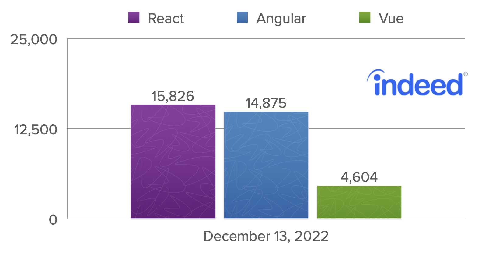
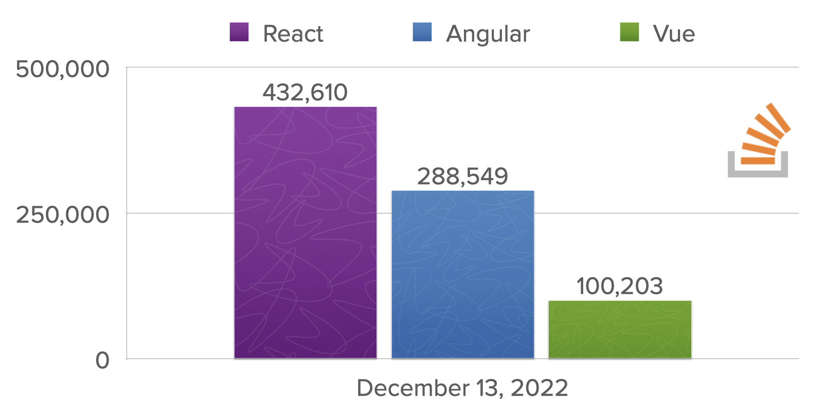
JHipster supports three UI frameworks: Angular, React, and Vue. Since this is a mini-book, I’m going to stick with showing Angular only. You can see from the following graphs that React and Angular are the most popular JavaScript frameworks.
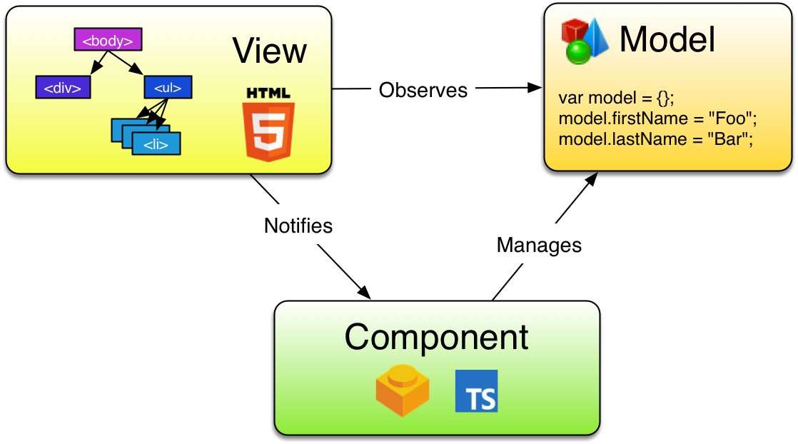
Angular is the default UI framework used by JHipster. It’s written in TypeScript, compiles to JavaScript, and just using it makes you a hipster! Like Struts in the early 2000s and Rails in the mid-2000s, Angular and other JavaScript frameworks have changed how developers write web applications. Today, data is exposed via REST APIs, and UIs are written in JavaScript (or TypeScript). As a Java developer, I was immediately attracted to Angular when I saw its separation of concerns. It recommended organizing your application into several components:
-
Components: Classes that retrieve data from services and expose it to templates.
-
Services: Classes that make HTTP calls to a JSON API.
-
Templates: HTML pages that display data. Use Angular directives to iterate over collections and show/hide elements.
-
Pipes: Data-manipulation tools that can transform data (e.g., uppercase, lowercase, ordering, and searching).
-
Directives: HTML processors that allow components to be written. Similar to JSP tags.
History
AngularJS was started by Miško Hevery in 2009. He was working on a project that was using GWT. Three developers had been developing the product for six months, and Miško rewrote the whole thing in AngularJS in three weeks. At that time, AngularJS was a side project he’d created. It didn’t require you to write much in JavaScript, as you could program most of the logic in HTML. The GWT version of the product contained 17,000 lines of code. The AngularJS version was only 1,000 lines of code!
In October 2014, the AngularJS team announced they were building Angular 2.0. The announcement led to a bit of upheaval in the Angular developer community. The API for writing Angular applications was going to change, and it was to be based on a new language, AtScript. There would be no migration path, and users would have to continue using 1.x or rewrite their applications for 2.x.
A new syntax was introduced that binds data to element properties, not attributes. This syntax allows you to use any web component in an Angular app, not just those retrofitted to work with Angular.
<input type="text" [value]="firstName">
<button (click)="addPerson()">Add</button>
<input type="checkbox" [checked]="someProperty">
In March 2015, the Angular team addressed community concerns, announced they would be using TypeScript over AtScript and that they would provide a migration path for Angular 1.x users. They also adopted semantic versioning and recommended people call it "Angular" instead of Angular 2.0.
Angular 2.0 was released in September 2016. Angular 4.0 was released in March 2017. JHipster 4.6.0 was released on July 6, 2017, and was the first release to contain production-ready Angular support. JHipster 7 uses Angular 14. Angular released version 15 during the production of this book.
You can find the Angular project at https://angular.io.
Basics
Creating a component that says "Hello World" with Angular is pretty simple.
import { Component } from '@angular/core';

@Component({
  selector: 'my-app',
  template: `<h1>Hello {{name}}</h1>`
})
export class AppComponent {
  name = 'World';
}
In this example, the name variable in the component maps to the value displayed in {{name}}. To render this component on a page, you’ll need a few more files: a module definition, a bootstrapping class, and an HTML file. A basic module definition contains component declarations, imports, providers, and a class to bootstrap.
import { BrowserModule } from '@angular/platform-browser';
import { NgModule } from '@angular/core';
import { AppComponent } from './app.component';

@NgModule({
  declarations: [
    AppComponent
  ],
  imports: [
    BrowserModule
  ],
  providers: [],
  bootstrap: [AppComponent]
})
export class AppModule { }
Then you’ll need a bootstrap file, typically named main.ts. This file bootstraps the module.
import { platformBrowserDynamic } from '@angular/platform-browser-dynamic';
import { AppModule } from './app/app.module';

platformBrowserDynamic().bootstrapModule(AppModule)
  .catch(err => console.error(err));
Finally, you’ll need a basic HTML file that renders the component.
<html>
<head>
    <title>Howdy</title>
</head>
<body>
    <my-app></my-app>
    <script src="path/to/compiled/javascript.js"></script>
</body>
</html>
The MVC pattern is a common one for web frameworks to implement. With Angular, the model is represented by an object you create or retrieve from a service. The view is an HTML template, and the component is a class that sets variables to be read by the template.
Below is a SearchService to fetch search results. It’s expected that a JSON endpoint exists at /api/search on the same server.
import { Injectable } from '@angular/core';
import { HttpClient } from '@angular/common/http';
import { Observable } from 'rxjs';

@Injectable({
  providedIn: 'root'
})
export class SearchService {

  constructor(private http: HttpClient) {}

  search(term): Observable<any> {
    return this.http.get(`/api/search/${term}`);
  }
}
An associated SearchComponent can be used to display the results from this service. Notice how you can use constructor injection to get a reference to the service.
import { Component } from '@angular/core';
import { SearchService } from '../search.service';

@Component({
  selector: 'app-search',
  templateUrl: './search.component.html',
  styleUrls: ['./search.component.css']
})
export class SearchComponent {
  query: string = '';
  searchResults: Array<any> = [];

  constructor(private searchService: SearchService) {
    console.log('In Search Component...');
  }

  search(): void {
    this.searchService.search(this.query).subscribe({
      next: (data: any) => {
        this.searchResults = data;
      },
      error: error => console.log(error)
    });
  }
}| To see the JavaScript console in Chrome, use kbd:[Command+Option+J] in Mac OS X/macOS or kbd:[Control+Shift+J] in Windows or Linux. |
To make this component available at a URL, you can use Angular’s Router and specify the path in the module that includes the component.
import { BrowserModule } from '@angular/platform-browser';
import { NgModule } from '@angular/core';
import { FormsModule } from '@angular/forms';
import { HttpClientModule } from '@angular/common/http';

import { AppComponent } from './app.component';
import { SearchComponent } from './search/search.component';
import { Routes, RouterModule } from '@angular/router';

const appRoutes: Routes = [
  { path: 'search', component: SearchComponent },
  { path: '', redirectTo: '/search', pathMatch: 'full' }
];

@NgModule({
  declarations: [
    AppComponent,
    SearchComponent
  ],
  imports: [
    BrowserModule,
    FormsModule,
    HttpClientModule,
    RouterModule.forRoot(appRoutes)
  ],
  providers: [],
  bootstrap: [AppComponent]
})
export class AppModule { }
In the app’s main entry point, AppComponent in this case, you’ll need to specify the router outlet in a template.
<router-outlet></router-outlet>The template for the SearchComponent can be as simple as a form with a button.
<h2>Search</h2>
<form>
  <input type="search" name="query" [(ngModel)]="query" (keyup.enter)="search()">
  <button type="button" (click)="search()">Search</button>
</form>
Now that you’ve seen the code, let’s look at how everything works in the SearchComponent.
@Component({
  selector: 'app-search',
  templateUrl: './search.component.html',
  styleUrls: ['./search.component.css']
})
export class SearchComponent {
  query: string = '';
  searchResults: Array<any> = [];

  constructor(private searchService: SearchService) { (1)
    console.log('In Search Component...');
  }

  search(): void { (2)
    this.searchService.search(this.query).subscribe({ (3)
      next: (data: any) => {
        this.searchResults = data;
      },
      error: error => console.log(error)
    });
  }
}| 1 | To inject SearchService into SearchComponent, simply add it as a parameter to the component’s constructor. TypeScript automatically makes constructor dependencies available as class variables. |
| 2 | search() is a method that’s called from the HTML’s <input> and <button>, wired up using the (keyup.enter) and (click) event handlers. |
| 3 | this.query is a variable that’s wired to <input> using the [(ngModel)] directive. This syntax provides two-way binding, so if you change the value in the component, it changes it in the rendered HTML. You can think of it this way: [] ⇒ component to template and () ⇒ template to component. |
To make the aforementioned code work, you can generate a new Angular project using Angular CLI. To install Angular CLI, you can use npm.
npm i -g @angular/cliThen generate a new application using ng new. When prompted to install Angular routing, type “Y”. For the stylesheet format, choose “CSS” (the default).
ng new ng-demoThis creates all the files you need for a basic app, installs dependencies, and sets up a build system for compiling your TypeScript code to JavaScript.
You can generate the SearchService using ng generate service search (or ng g s search).
$ ng g s search
CREATE src/app/search.service.spec.ts (357 bytes)
CREATE src/app/search.service.ts (135 bytes)
And you can generate the SearchComponent using ng generate component search (or ng g c search).
$ ng g c search
CREATE src/app/search/search.component.css (0 bytes)
CREATE src/app/search/search.component.html (21 bytes)
CREATE src/app/search/search.component.spec.ts (599 bytes)
CREATE src/app/search/search.component.ts (202 bytes)
UPDATE src/app/app.module.ts (475 bytes)
Does your API return data like the following?
[
  {
    "id": 1,
    "name": "Nikola Jokić",
    "phone": "(720) 555-1212",
    "address": {
      "street": "2000 16th Street",
      "city": "Denver",
      "state": "CO",
      "zip": "80202"
    }
  },
  {
    "id": 2,
    "name": "Jamal Murray",
    "phone": "(303) 321-8765",
    "address": {
      "street": "2654 Washington Street",
      "city": "Lakewood",
      "state": "CO",
      "zip": "80568"
    }
  },
  {
    "id": 3,
    "name": "Aaron Gordon",
    "phone": "(303) 323-1233",
    "address": {
      "street": "46 Creekside Way",
      "city": "Winter Park",
      "state": "CO",
      "zip": "80482"
    }
  }
]
If so, you could display it in the search.component.html template with Angular’s *ngFor directive.
<table *ngIf="searchResults.length">
  <thead>
  <tr>
    <th>Name</th>
    <th>Phone</th>
    <th>Address</th>
  </tr>
  </thead>
  <tbody>
  <tr *ngFor="let person of searchResults; let i=index">
    <td><a [routerLink]="['/edit', person.id]">{{person.name}}</a></td>
    <td>{{person.phone}}</td>
    <td>{{person.address.street}}<br/>
      {{person.address.city}}, {{person.address.state}} {{person.address.zip}}
    </td>
  </tr>
  </tbody>
</table>
To read a more in-depth example (including source code and tests) of building a search/edit application with Angular, see my Bare Bones Angular and Angular CLI Tutorial.
Now that you’ve learned a bit about one of the hottest web frameworks on the planet, let’s take a look at the most popular CSS framework: Bootstrap.
Bootstrap
Bootstrap is a CSS framework that simplifies the development of web applications. It provides many CSS classes and HTML structures that allow you to develop HTML user interfaces that look good. Not only that, but it’s responsive by default, which means it works better (or even best) on a mobile device.
Bootstrap’s grid system
Most CSS frameworks provide a grid system that allows you to position columns and cells in a respectable way. Bootstrap’s powerful grid is built with containers, rows, and columns. It’s based on the CSS3 flexible box, or flexbox. Flexbox is a layout mode that accommodates different screen sizes and display devices. It’s easier than using blocks to do layouts because it doesn’t use floats, nor do the flex container’s margins collapse with the margins of its content.
CSS-Tricks has A Complete Guide to Flexbox that explains its concepts well.
The main idea behind the flex layout is to allow the container to alter its items' width/height (and order) to fill the available space best, mostly to accommodate all kinds of display devices and screen sizes. A flex container expands items to fill available free space or shrinks them to prevent overflow.
Bootstrap’s grid width varies based on the viewport width. The table below shows how aspects of the grid system work across different devices.
| Extra small | Small | Medium | Large | Extra large | Extra extra large | |
|---|---|---|---|---|---|---|
Max container width |
<576px |
≥576px |
≥768px |
≥992px |
≥1200px |
≥1400px |
Class prefix |
|
|
|
|
|
|
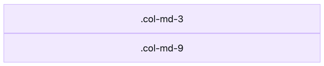
A basic example of the grid is shown below.
<div class="container text-center">
  <div class="row">
    <div class="col-md-3">.col-md-3 <!-- 3 columns on the left --></div>
    <div class="col-md-9">.col-md-9 <!-- 9 columns on the right --></div>
  </div>
</div>
When rendered with Bootstrap’s CSS, the above HTML looks as follows on a desktop. The minimum width of the container element on the desktop is set to 1200 px.

If you squish your browser to less than 1200 px wide or render this same document on a smaller screen, the columns will stack.
Bootstrap’s grid can be used to align and position your application’s elements, widgets, and features. Understanding a few basics is helpful if you want to use it effectively.
-
It’s based on 12 columns.
-
Just use “md” class and fix as needed.
-
It can be used to size input fields.
Bootstrap’s grid system has five tiers of classes: xs (portrait phones), sm (landscape phones), md (tablets), lg (desktops), and xl (large desktops). You can use nearly any combination of these classes to create more dynamic and flexible layouts. Below is an example of a grid that’s a little more advanced.
Each tier of classes scales up, meaning that if you plan to set the same widths for xs and sm, you only need to specify xs.
<div class="container text-center">
  <!-- Stack the columns on mobile by making one full-width and the other half-width -->
  <div class="row">
    <div class="col-md-8">.col-md-8</div>
    <div class="col-6 col-md-4">.col-6 .col-md-4</div>
  </div>

  <!-- Columns start at 50% wide on mobile and bump up to 33.3% wide on desktop -->
  <div class="row">
    <div class="col-6 col-md-4">.col-6 .col-md-4</div>
    <div class="col-6 col-md-4">.col-6 .col-md-4</div>
    <div class="col-6 col-md-4">.col-6 .col-md-4</div>
  </div>

  <!-- Columns are always 50% wide, on mobile and desktop -->
  <div class="row">
    <div class="col-6">.col-6</div>
    <div class="col-6">.col-6</div>
  </div>
</div>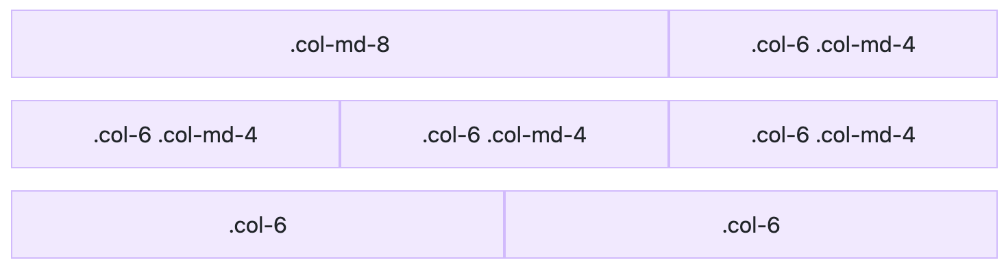
You can use size indicators to specify breakpoints in the columns. Breakpoints indicate where a column wraps onto the next row. In the HTML above, “xs” and “md” are the size indicators (of course, “sm”, “lg”, and “xl” are the other options). Bootstrap uses the following media query ranges.
// Extra small devices (portrait phones, less than 576 px)
// No media query since this is the default in Bootstrap

// Small devices (landscape phones, 576 px and up)
@media (min-width: 576px) { ... }

// Medium devices (tablets, 768 px and up)
@media (min-width: 768px) { ... }

// Large devices (desktops, 992 px and up)
@media (min-width: 992px) { ... }

// Extra large devices (large desktops, 1200 px and up)
@media (min-width: 1200px) { ... }

// Extra extra large devices (extra large desktops, 1400 px and up)
@media (min-width: 1400px) { ... }
If you’re using Sass, all Bootstrap’s media queries are available via Sass mixins:
// No media query necessary for xs breakpoint as it's effectively `@media (min-width: 0) { ... }`
@include media-breakpoint-up(sm) { ... }
@include media-breakpoint-up(md) { ... }
@include media-breakpoint-up(lg) { ... }
@include media-breakpoint-up(xl) { ... }

// Example: Hide starting at `min-width: 0`, and then show at the `sm` breakpoint
.custom-class {
  display: none;
}
@include media-breakpoint-up(sm) {
  .custom-class {
    display: block;
  }
}
Responsive utility classes
Bootstrap also includes several utility classes that can be used to show and hide elements based on the browser size, like .d-[xs|sm|md|lg|xl|xxl]-block and .d-[xs|sm|md|lg|xl|xxl]-none. There are no explicit "show" responsive utility classes; you make an element visible by simply not hiding it at that breakpoint size.
Bootstrap’s classes for setting the display are names using the following format:
-
.d-{value}forxs -
.d-{breakpoint}-{value}forsm,md,lg,xl, and `xxl
The media queries affect screen widths with the given breakpoint or larger. For example, .d-lg-none sets display: none on both lg, xl, and xxl screens.
The following example from 21-Points Health shows how to display a shorter heading on mobile and a larger one on bigger screens.
<div class="col-6 text-nowrap">
  <h4 class="mt-1 d-none d-md-inline"
    jhiTranslate="home.bloodPressure.title">Blood Pressure:</h4>
  <h4 class="mt-1 d-sm-none"
    jhiTranslate="home.bloodPressure.titleMobile">BP:</h4>
</div>
Forms
When you add Bootstrap’s CSS to your web application, it’ll quickly start to look better. Typography, margins, and padding will look better by default. However, your forms might look funny because Bootstrap requires a few classes on your form elements to make them look good.
Below is an example of a form element.
<div class="mb-3">
  <label for="description">Description</label>
  <textarea class="form-control" rows="4" name="description" id="description"></textarea>
</div>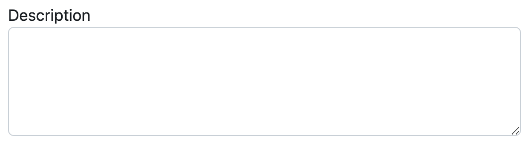
If you’d like to indicate that this form element is invalid, you’ll need to modify the above HTML to display validation warnings.
<div class="mb-3">
  <label for="description">Description</label>
  <textarea class="form-control is-invalid" rows="4" id="description" required></textarea>
  <span class="invalid-feedback">Description is a required field.</span>
</div>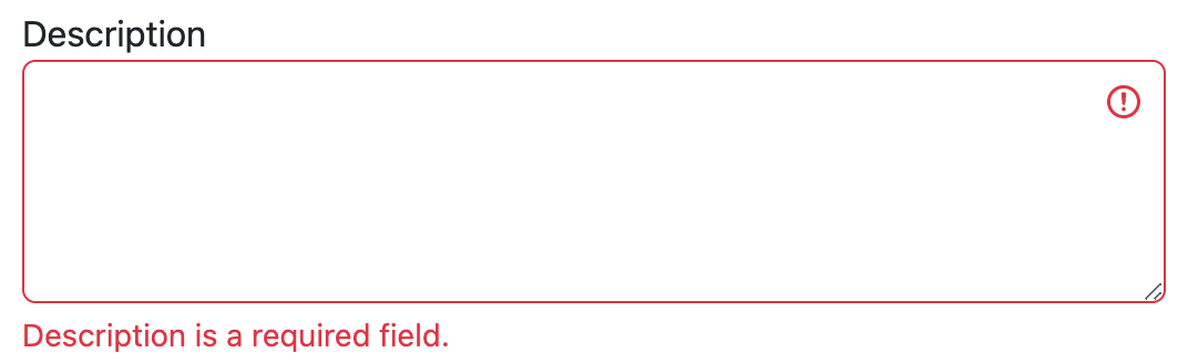
CSS
When you add Bootstrap’s CSS to an HTML page, the default settings immediately improve the typography. Your <h1> and <h2> headings become semi-bold and are sized accordingly. Your paragraph margins, body text, and block quotes will look better. If you want to align text in your pages, text-[left|center|right] are useful classes. For tables, a table class gives them a better look and feel by default.
To make your buttons look better, Bootstrap provides btn and several btn-* classes.
<button type="button" class="btn btn-primary">Primary</button>
<button type="button" class="btn btn-secondary">Secondary</button>
<button type="button" class="btn btn-success">Success</button>
<button type="button" class="btn btn-danger">Danger</button>
<button type="button" class="btn btn-warning">Warning</button>
<button type="button" class="btn btn-info">Info</button>
<button type="button" class="btn btn-light">Light</button>
<button type="button" class="btn btn-dark">Dark</button>
<button type="button" class="btn btn-link">Link</button>
Components
Bootstrap ships with several components included. Some require JavaScript; some only require HTML5 markup and CSS classes. Its rich set of components has helped make it one of the most popular projects on GitHub. Web developers have always liked components in their frameworks. A framework that offers easy-to-use components often allows developers to write less code. Less code to write means there’s less code to maintain!
Popular Bootstrap components include dropdowns, button groups, button dropdowns, navbar, breadcrumbs, pagination, alerts, progress bars, and panels. Below is an example of a navbar with a dropdown.
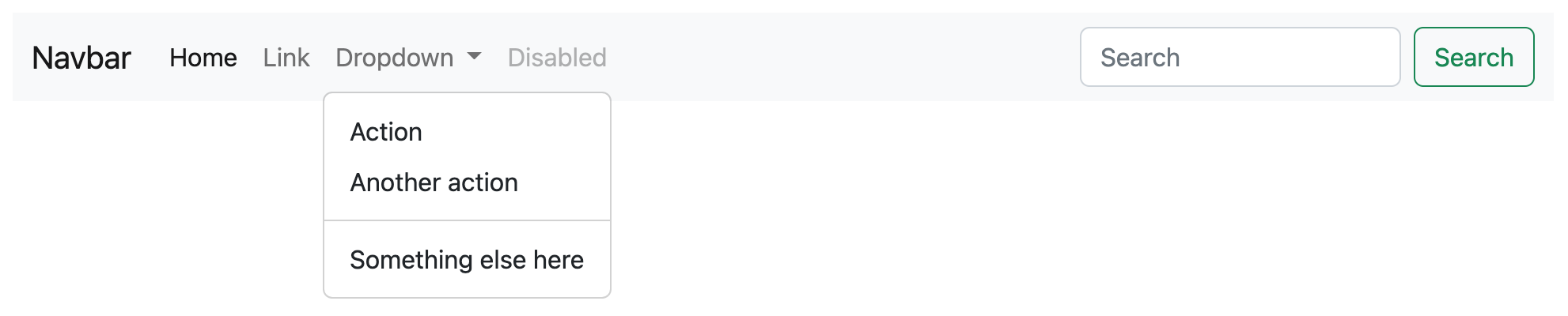
When rendered on a mobile device, everything collapses into a hamburger menu that can expand downward.
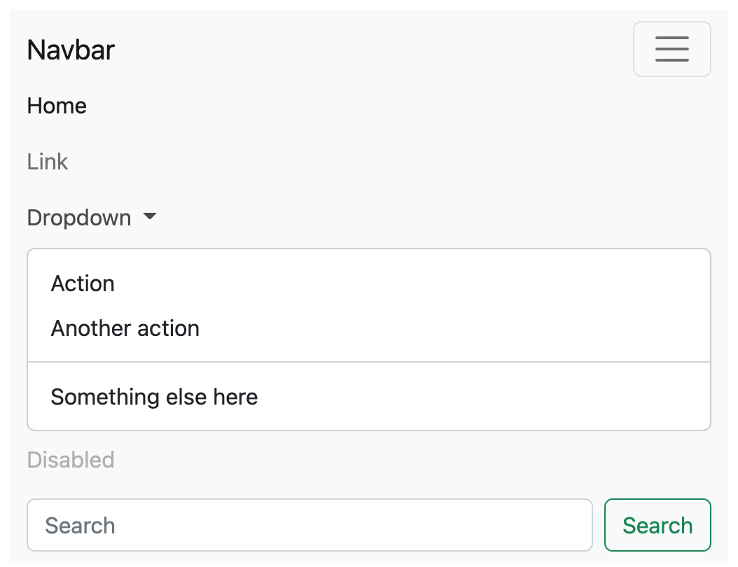
This navbar requires quite a bit of HTML markup, not shown here for the sake of brevity. You can view this source online in Bootstrap’s documentation. An example without ARIA attributes below shows the basic structure.
<nav class="navbar navbar-expand-lg bg-light">
<div class="container-fluid">
<a class="navbar-brand" href="#">Navbar</a>
<button class="navbar-toggler" type="button" data-bs-toggle="collapse"
data-bs-target="#navbarSupportedContent">
<span class="navbar-toggler-icon"></span>
</button>
<div class="collapse navbar-collapse" id="navbarSupportedContent">
<ul class="navbar-nav me-auto mb-2 mb-lg-0">
<li class="nav-item">
<a class="nav-link active" href="#">Home</a>
</li>
<li class="nav-item">
<a class="nav-link" href="#">Link</a>
</li>
<li class="nav-item dropdown">
<a class="nav-link dropdown-toggle" href="#" role="button"
data-bs-toggle="dropdown">
Dropdown
</a>
<ul class="dropdown-menu">
<li><a class="dropdown-item" href="#">Action</a></li>
<li><a class="dropdown-item" href="#">Another action</a></li>
<li><hr class="dropdown-divider"></li>
<li><a class="dropdown-item" href="#">Something else here</a></li>
</ul>
</li>
<li class="nav-item">
<a class="nav-link disabled">Disabled</a>
</li>
</ul>
<form class="d-flex" role="search">
<input class="form-control me-2" type="search" placeholder="Search">
<button class="btn btn-outline-success" type="submit">Search</button>
</form>
</div>
</div>
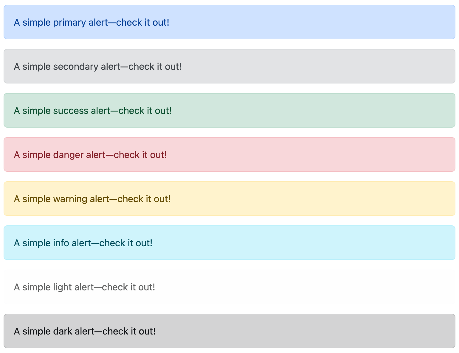
</nav>Alerts are useful for displaying feedback to the user. You can invoke differently colored alerts with different classes. You’ll need to add an alert class, plus alert-[success|info|warning|danger] to indicate the colors.
<div class="alert alert-primary" role="alert">
  A simple primary alert—check it out!
</div>
<div class="alert alert-secondary" role="alert">
  A simple secondary alert—check it out!
</div>
<div class="alert alert-success" role="alert">
  A simple success alert—check it out!
</div>
<div class="alert alert-danger" role="alert">
  A simple danger alert—check it out!
</div>
<div class="alert alert-warning" role="alert">
  A simple warning alert—check it out!
</div>
<div class="alert alert-info" role="alert">
  A simple info alert—check it out!
</div>
<div class="alert alert-light" role="alert">
  A simple light alert—check it out!
</div>
<div class="alert alert-dark" role="alert">
  A simple dark alert—check it out!
</div>
This renders alerts like the following.
To make an alert closeable, you need to add an .alert-dismissible class and a close button.
<div class="alert alert-warning alert-dismissible fade show" role="alert">
  <strong>Warning!</strong> Better check yourself, you're not looking too good.
  <button type="button" class="btn-close" data-bs-dismiss="alert" aria-label="Close"></button>
</div>
To make the links in your alerts match the colors of the alerts, use .alert-link.
|
Icons
Icons have always been a big part of web applications. Showing the user a small image is often sexier and hipper than plain text. Humans are visual beings, and icons are a great way to spice things up. In the last several years, font icons have become popular for web development. Font icons are just fonts but contain symbols and glyphs instead of text. Because of their small size, you can style, scale, and load them quickly.
Bootstrap Icons is an icon library created by the Bootstrap team. You can install them using npm i bootstrap-icons. You can use them as SVGs, SVG sprites, or web fonts.
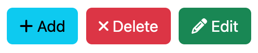
Font Awesome has 2,018 icons and is included by default in JHipster with angular-fontawesome. It is often used to display eye candy on buttons.
<button class="btn btn-info"><fa-icon icon="plus"></fa-icon> Add</button>
<button class="btn btn-danger"><fa-icon icon="times"></fa-icon> Delete</button>
<button class="btn btn-success"><fa-icon icon="pencil-alt"></fa-icon> Edit</button>
You can see how the icons change color based on the font color defined for the element that contains them.
Customizing CSS
If you’d like to override Bootstrap classes in your project, just put the override rule in a CSS file that comes after Bootstrap’s CSS. Or you can modify src/main/webapp/content/scss/global.scss directly. Using Sass results in a much more concise authoring environment. Below is the default vendor.scss file that JHipster generates. You can see that it imports Bootstrap, and I’ve added an import for Angular Calendar. Default Bootstrap rules are overridden in the aforementioned global.scss.
/* after changing this file run 'npm run webapp:build' */

/***************************
put Sass variables here:
eg $input-color: red;
****************************/

// Calendar styles
@import '~angular-calendar/scss/angular-calendar';
// Override Bootstrap variables
@import 'bootstrap-variables';
// Import Bootstrap source files from node_modules
@import '~bootstrap/scss/bootstrap';

/* jhipster-needle-scss-add-vendor JHipster will add new css style */
There’s also a src/main/webapp/content/scss/_bootstrap-variable.scss file. You can modify this file to change the default Bootstrap settings like colors, border radius, etc.
Angular and Bootstrap
JHipster includes ng-bootstrap by default. This library provides Bootstrap 5 components powered by Angular instead of jQuery.
Popular alternatives to Bootstrap include Angular Material and Ionic Framework. There is no support for these frameworks at this time. Integrating them would require that all templates be rewritten to include their classes instead of Bootstrap’s. While possible, it’d be a lot of work to create and maintain.
Internationalization (i18n)
Internationalization (also called i18n because the word has 18 letters between “i” and “n”) is a first-class citizen in JHipster. Translating an application to another language is easiest if you put the i18n system in place at the beginning of a project. ngx-translate provides directives that make translating your application into multiple languages easy. It also provides a service that allows changing the language at runtime.
To use i18n in a JHipster project, you simply add a “jhiTranslate” attribute with a key.
<label for="username" jhiTranslate="global.form.username">Login</label>The key references a JSON document, which will return the translated string. Angular will then replace the “First Name” string with the translated version.
JHipster allows you to choose a default language and translations when you first create a project. It stores the JSON documents for these languages in src/main/webapp/i18n. You can install additional languages using jhipster languages. As of December 2022, JHipster supports 47 languages. You can also add a new language. To set the default language, modify translation.module.ts and its setDefaultLang() setting.
export class TranslationModule {
  constructor(...) {
    translateService.setDefaultLang('en');
    ...
  }
}
Sass
Sass stands for “syntactically awesome style sheets”. It’s a language for writing CSS with the goodies you’re used to using in modern programming languages, such as variables, nesting, mixins, and inheritance. Sass uses the $ symbol to indicate a variable, which can be referenced later in your document.
$font-stack: Helvetica, sans-serif
$primary-color: #333

body
  font: 100% $font-stack
  color: $primary-color
Sass 3 introduces a new syntax known as SCSS that is fully compatible with the syntax of CSS3, while still supporting the full power of Sass. It looks more like CSS.
$font-stack: Helvetica, sans-serif;
$primary-color: #333;

body {
  font: 100% $font-stack;
  color: $primary-color;
}
The code above renders the following CSS.
body {
  font: 100% Helvetica, sans-serif;
  color: #333;
}
Another powerful feature of Sass is the ability to write nested CSS selectors. When writing HTML, you can often visualize the hierarchy of elements. Sass allows you to bring that hierarchy into your CSS.
nav {
  ul {
    margin: 0;
    padding: 0;
    list-style: none;
  }

  li {
    display: inline-block;
  }

  a {
    display: block;
    padding: 6px 12px;
    text-decoration: none;
  }
}| Overly nested rules will result in overqualified CSS that can be hard to maintain. |
As mentioned, Sass also supports partials, imports, mixins, and inheritance. Mixins can be particularly useful for handling vendor prefixes.
@mixin border-radius($radius) { (1)
    -webkit-border-radius: $radius;
       -moz-border-radius: $radius;
        -ms-border-radius: $radius;
            border-radius: $radius;
}

.box { @include border-radius(10px); } (2)| 1 | Create a mixin using @mixin and give it a name. This uses $radius as a variable to set the radius value. |
| 2 | Use @include followed by the name of the mixin. |
CSS generated from the above code looks as follows.
.box {
  -webkit-border-radius: 10px;
  -moz-border-radius: 10px;
  -ms-border-radius: 10px;
  border-radius: 10px;
}
Bootstrap 3.x was written with Less, a CSS pre-processor with similar features to Sass. It uses Sass for the 4.0+ versions.
JHipster 7 uses Sass by default. To learn more about structuring your CSS and naming classes, read the great Scalable and Modular Architecture for CSS.
Webpack
JHipster 4+ uses webpack for building the client. JHipster 3.x used Gulp. Gulp allows you to perform tasks like minification, concatenation, compilation (e.g., from TypeScript/CoffeeScript to JavaScript), unit testing, and more. webpack is a more modern solution that’s become very popular for Angular projects and is included under the covers in Angular CLI.
webpack is a module bundler that recursively builds a dependency graph with every module your application needs. It packages all of these modules into smaller bundles to be loaded by the browser. Its code-splitting abilities make it possible to break up large JavaScript applications into small chunks to be loaded on demand.
It has four core concepts:
-
Entry: This tells webpack where to start and follows the graph of dependencies to know what to bundle.
-
Output: Once you’ve bundled all of your assets together, you need to tell webpack where to put them.
-
Loaders: webpack treats every file (.css, .scss, .ts, .png, .html, etc.) as a module but only understands JavaScript. Loaders transform files into modules as they are added to the dependency graph.
-
Plugins: Loaders execute transforms per file. Plugins perform actions and customizations on chunks of your bundled modules.
Below is a basic webpack.config.js that shows all four concepts in use.
const HtmlWebpackPlugin = require('html-webpack-plugin'); // installed via npm
const webpack = require('webpack'); // to access built-in plugins
const path = require('path');

const config = {
  entry: './path/to/my/entry/file.js',
  output: {
    path: path.resolve(__dirname, 'dist'),
    filename: 'my-first-webpack.bundle.js'
  },
  module: {
    rules: [
      { test: /\.txt$/, use: 'raw-loader' }
    ]
  },
  plugins: [
    new webpack.optimize.UglifyJsPlugin(),
    new HtmlWebpackPlugin({template: './src/index.html'})
  ]
};

module.exports = config;
In the Angular section, I mentioned Angular CLI and my ng-demo project that shows how to use it. Angular CLI uses webpack internally, but you never see it because it wraps everything in its ng command. To see its webpack config or to tweak it for your needs, you can eject it from your project by running ng eject.
I tried running this and found it added 20 dependencies to the project’s package.json and generated a webpack.config.js file that’s over 450 lines of code! This is roughly equivalent to the lines of code in a JHipster project’s webpack configuration. JHipster generates a webpack directory containing files for different scenarios: dev mode with hot reload, testing, and production optimizations.
-
logo-jhipster.pngis the logo that shows in desktop alerts for build notifications. -
environment.jsspecifies the project’s version, i18n hash, and server API URL. -
webpack.custom.jsis the main configuration file that defines adevelopmentand aproductionmode. Dev mode enables hot-reloading with Browsersync and desktop notifications. HTML templates are converted to JavaScript, and source maps are created for production.
To learn more about webpack, I recommend visiting its getting started guide.
WebSockets
The WebSocket API (aka WebSockets) is an advanced technology that makes it possible to open an interactive communication channel between the user’s browser and a server. With this API, you can send messages to a server and receive event-driven responses without polling the server for a reply. WebSockets have been called “TCP for the Web”.
If you choose "WebSockets using Spring Websocket" as part of the "other technologies" options when creating a JHipster project, you’ll get two JavaScript libraries added to your project:
To see how WebSockets work, take a look at the JhiTrackerComponent in a WebSockets-enabled project. This displays real-time activity information posted to the /websocket/tracker endpoint.
import { Component, Inject, Vue } from 'vue-property-decorator';
import { Subscription } from 'rxjs';

import TrackerService from './tracker.service';

@Component
export default class JhiTrackerComponent extends Vue {

  public activities: any[] = [];
  private subscription?: Subscription;

  @Inject('trackerService') private trackerService: () => TrackerService;

  public mounted(): void {
    this.init();
  }

  public destroyed(): void {
    if (this.subscription) {
      this.subscription.unsubscribe();
      this.subscription = undefined;
    }
  }

  public init(): void {
    this.subscription = this.trackerService().subscribe(activity => {
      this.showActivity(activity);
    });
  }

  public showActivity(activity: any): void {
    let existingActivity = false;
    for (let index = 0; index < this.activities.length; index++) {
      if (this.activities[index].sessionId === activity.sessionId) {
        existingActivity = true;
        if (activity.page === 'logout') {
          this.activities.splice(index, 1);
        } else {
          this.activities.splice(index, 1);
          this.activities.push(activity);
        }
      }
    }
    if (!existingActivity && activity.page !== 'logout') {
      this.activities.push(activity);
    }
  }
}
The Tracker service allows you to send tracking information—for example, to track when someone has authenticated.
import * as SockJS from 'sockjs-client';
import { Observer, map } from 'rxjs';
import VueRouter from 'vue-router';
import { Store } from 'vuex';
import { RxStomp } from '@stomp/rx-stomp';

import { AccountStateStorable } from '@/shared/config/store/account-store';

const DESTINATION_TRACKER = '/topic/tracker';
const DESTINATION_ACTIVITY = '/topic/activity';

export default class TrackerService {
  private rxStomp: RxStomp;

  constructor(
    private router: VueRouter,
    private store: Store<AccountStateStorable>,
  ) {
    this.stomp = new RxStomp();
    this.router.afterEach(() => this.sendActivity());

    this.store.watch(
      (_state, getters) => getters.authenticated,
      (value, oldValue) => {
        if (value === oldValue) return;
        if (value) {
          return this.connect();
        }
        return this.disconnect();
      }
    );
  }

  get stomp() {
    return this.rxStomp;
  }

  set stomp(rxStomp) {
    this.rxStomp = rxStomp;
    this.rxStomp.configure({
      debug: (msg: string): void => {
        console.log(new Date(), msg);
      },
    });
    this.rxStomp.connected$.subscribe(() => {
      this.sendActivity();
    });
  }

  private connect(): void {
    this.updateCredentials();
    return this.rxStomp.activate();
  }

  private disconnect(): Promise<void> {
    return this.rxStomp.deactivate();
  }

  private getAuthToken() {
    const authToken = localStorage.getItem('jhi-authenticationToken') ||
      sessionStorage.getItem('jhi-authenticationToken');
    return JSON.parse(authToken);
  }

  private buildUrl(): string {
    const loc = window.location;
    const baseHref = document.querySelector('base').getAttribute('href');
    const url = '//' + loc.host + baseHref + 'websocket/tracker';
    const authToken = this.getAuthToken();
    if (authToken) {
      return `${url}?access_token=${authToken}`;
    }
    return url;
  }

  private updateCredentials(): void {
    this.rxStomp.configure({
      webSocketFactory: () => {
        return new SockJS(this.buildUrl());
      },
    });
  }

  private sendActivity(): void {
    this.rxStomp.publish({
      destination: DESTINATION_ACTIVITY,
      body: JSON.stringify({page: this.router.currentRoute.fullPath}),
    });
  }

  public subscribe(observer) {
    return this.rxStomp
      .watch(DESTINATION_TRACKER)
      .pipe(map(imessage => JSON.parse(imessage.body)))
      .subscribe(observer);
  }
};
WebSockets on the server side of a JHipster project are implemented with Spring’s WebSocket support. To learn more about WebSockets with Spring, see Baeldung’s Intro to WebSockets with Spring. The following section shows how a developer productivity tool that uses WebSockets implements something very cool.
Browsersync
Browsersync is one of those tools that makes you wonder how you ever lived without it. It keeps your assets in sync with your browser. It’s also capable of syncing browsers, so you can, for example, scroll in Safari and watch both windows scroll in Chrome and in Safari. When you save files, it updates your browser windows, saving you an incredible amount of time. As its website says, “It’s wicked-fast and totally free.”
Browsersync is free to run and reuse, as guaranteed by its open-source Apache 2.0 License. It contains many slick features:
-
Interaction sync: Browsersync mirrors your scroll, click, refresh, and form actions between browsers while you test.
-
File sync: Browsers automatically update as you change HTML, CSS, images, and other project files.
-
URL history: Browsersync records your test URLs so you can push them back out to all devices with a single click.
-
Remote inspector: You can remotely tweak and debug web pages running on connected devices.
To integrate Browsersync in your project, you need package.json and gulpfile.js files. Your package.json file only needs to contain a few things, weighing in at a slim 13 lines of JSON.
{
  "name": "jhipster-book",
  "version": "7.0.0",
  "description": "The JHipster Mini-Book",
  "author": "Matt Raible <matt@raibledesigns.com>",
  "license": "Apache-2.0",
  "repository": {
    "type": "git",
    "url": "git@github.com:mraible/jhipster-book.git"
  },
  "devDependencies": {
    "gulp": "4.0.2",
    "browser-sync": "2.27.10"
  }
}
The gulpfile.js utilizes the tools specified in package.json to enable Browsersync and create a magical web-development experience.
const gulp = require('gulp');
const browserSync = require('browser-sync').create();

gulp.task('serve', function () {
  browserSync.init({
    server: '.'
  });

  gulp.watch(['*.html', 'css/*.css'])
    .on('change', browserSync.reload);
});

gulp.task('default', gulp.series(['serve']));
After you’ve created these files, you’ll need to install Node.js and its package manager, npm. This should let you run the following command to install Browsersync and Gulp. You will only need to run this command when dependencies change in package.json.
npm install
Then run the following command to create a blissful development environment in which your browser auto-refreshes when files change on your hard drive.
gulp
JHipster integrates Browsersync for you, using webpack instead of Gulp. I show a Gulp example here because it’s so simple. I highly recommend Browsersync for your project. It’s useful for determining if your web application can handle a page reload without losing the current user’s state.
Summary
This section describes the UI components in a typical JHipster project. It taught you about the prevalent UI framework called Angular. It showed you how to author HTML pages and use Bootstrap to make things look pretty. A build tool is essential for building a modern web application, and this section showed you how you could use webpack. Finally, it showed you how WebSockets work and described the beauty of Browsersync.
Now that you’ve learned about many UI components in a JHipster project, let’s learn about the API side.